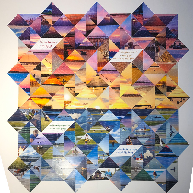
Unframed.
Click on image for larger view.
Sunsets and sunrises across the tidal marsh at Pine Point Maine have long inspired King family photographers. They are delightfully frequent during the summer months when the family populates the cottage purchased by Cyrus Shaw King back in the 1880s. There are a number of them that adorn the walls of the cottage, and each year we add to our collection of images, especially with the advent of digital photography and cellphone cameras.
In autumn of 2018, Jonathan and I attended a joint concert with the Minneapolis/Saint Paul men’s a capella group Cantus and the women’s a capella group Lorelei Ensemble based in Boston. Lorelei sang a piece called “Sun Quilt” by Gabriela Lena Frank, which set Laura Coates Reed’s poem “The Sunset” (below) to music.
My reaction to the whole experience was to think – “that describes Pine Point sunsets” – and the title triggered the idea to bring all the images (well, a selection of them anyway) into a quilt rather than to try to select one that epitomized all of them, and to incorporate the poem into the work also.
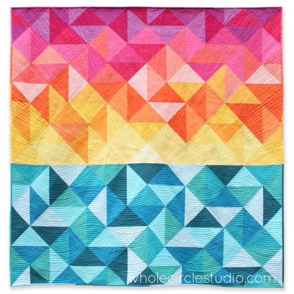
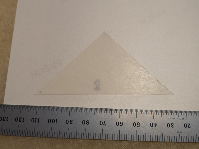
Later I went online to search quilt patterns and sunsets and found a pattern, shown above, from Whole Circle Studio for $9.95 called “Sun Salutations” that appealed to me (left image below, designed by Sheri Cifaldi-Morrill). I used a drawing program, Intaglio, to reproduce the pattern and create a map, and number the pieces. There are 210 triangles, but because four pairs were used as a single pieces for the poem, the final total number of pieces is 206. One of the reasons I selected this particular pattern was the straight edges of the pieces would be much easier to cut and piece together as compared to curved edges.

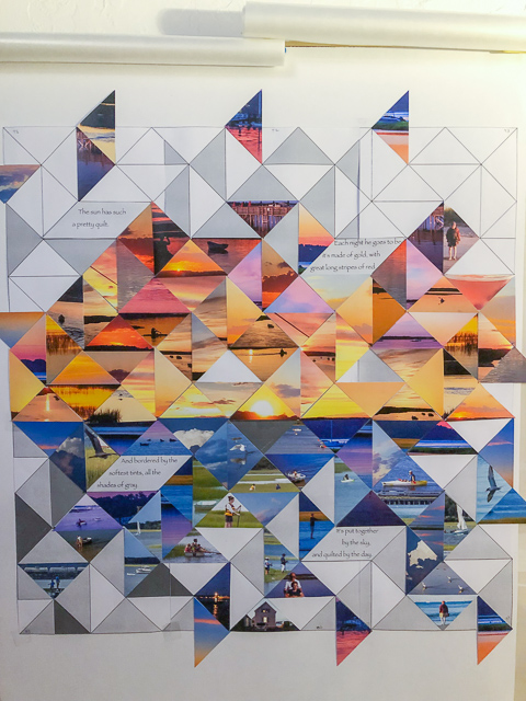
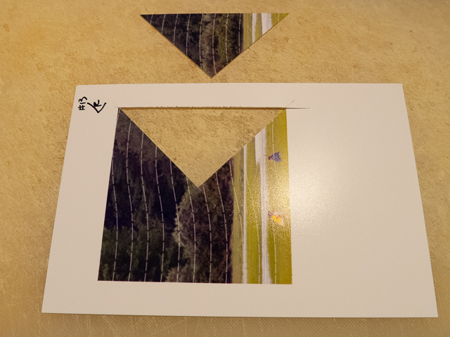
I printed the pattern/map and taped it to the glass of a framed print that hangs conveniently next to my computer (right image above), and then went in search of photos in my files, Jonathan’s files, Cindy’s iPhone, and the King family slide carousels. I found myself going beyond sunsets, including a number of shots of family and wildlife and assorted strangers fishing, boating, or paddling their way up and down the creek. I would then crop the various photos using 1x1 dimensions, and print them out so the printed images were 3 inches on a side – the long side of the triangular pieces. As these were the prototype pieces, I cut them with scissors rather than an X-acto knife into quadrants in an X pattern resulting in four triangular pieces – Top, Bottom, Right and Left (middle image above).
Usually there was a specific quadrant I was aiming to use, but based on what kind of color and intensity I needed, the remaining quadrants were frequently used also. Using double-sided tape, I would place them on the map, and rearranged them until I was satisfied.
To keep track of which piece came from which photo, I had written the filename on the back of each of them. Also, the photos were used in upright orientation, I didn’t rotate them. So once the I was satisfied with the placement, I then disassembled the prototype piece by piece logging the image’s filename and quadrant used in the Excel spreadsheet I used to keep track of them.
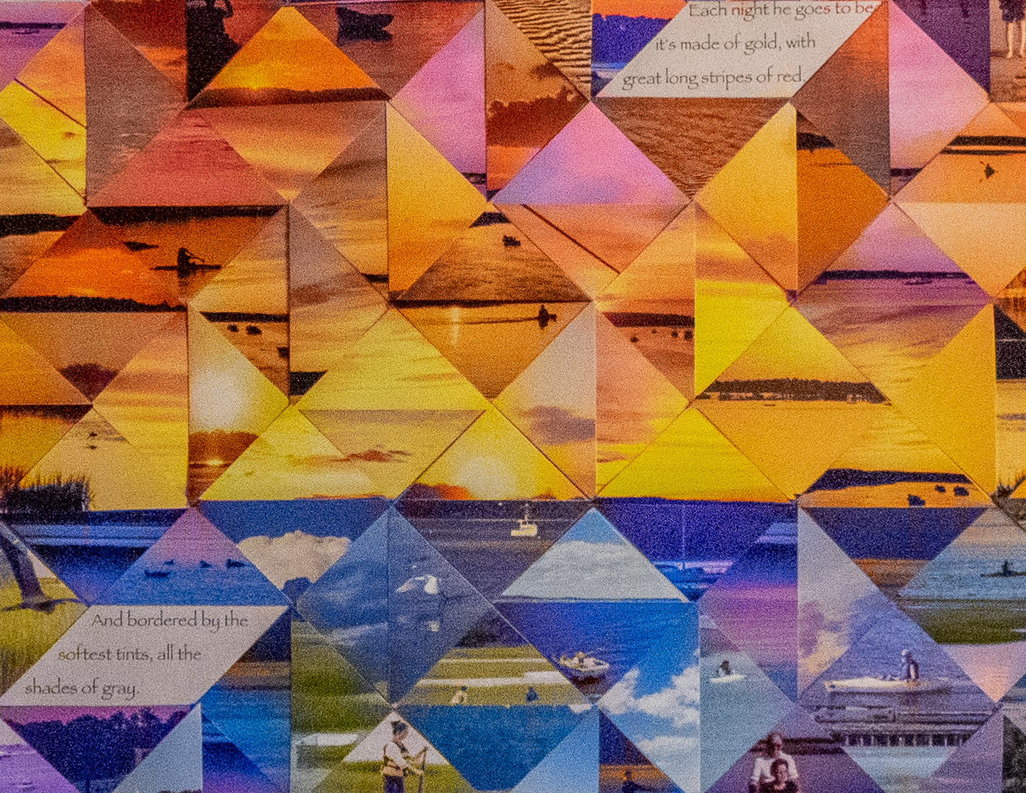
The next challenge was the stitching – I wanted to keep to the quilt motif, so something was needed to represent the stitching. Using the same drawing program and the previously created map, I made a pattern of lines similar to the stitching in the original piece, and used a custom dash pattern to try to give the stitching a more random pattern than the built-in options. I set the color of the lines to white, and used a 35% opacity to decrease the visual “pop” so the lines would be present, but not dominant.
To make the stitch-pattern line up properly, each image had to be placed at its assigned location in the drawing program map, and then the final high-quality print made using my old Epson Photo R260 onto Epson 4x6 Premium Photo Paper/Semi-gloss (left image below). I also made a back-up PDF file of the print image, which came in handy when I decided I needed to reprint a number of the pieces.

Once printed, I would dot the two corners of the long side to be used from that print on the back with a Sharpie by holding it up to the light. This was to provide guidance for placing the double-sided cellophane adhesive (obtained in 9x12” sheets, and cut into isosceles right triangles, 3.5” along the hypotenuse) on the back of the 4x6 print. One side of the adhesive was applied to the photo (right image above), the paper protecting the other side of the adhesive was left in place, and used to number the piece.
Once the adhesive was placed, an X-acto knife and a straight-edge were used to cut the piece. All pieces, except the doubled pieces for the poetry, were printed and cut prior to final placement on the medium.

For the poem, I printed out template shapes for Jonathan to use for writing out the poem using a fountain pen. From several prototypes, I selected the preferred version which I scanned into JPG files using a flat-bed scanner. I then used Photoshop CC to colorize the script. The variations in color intensity in the output are the result of variation in the amount of ink that the fountain pen delivered to the paper originally. This was one of the reasons I wanted Jonathan to do this by hand, in addition to his excellent penmanship. For the stitching pattern, I had to change the stitch color to a shade of gray that would give a similar intensity against a pure white background to the patterns in the pieces.
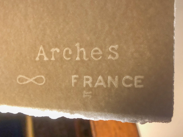

The backing medium was art paper (left image above) recommended by our local art supply store in Saint Paul, Wet Paint, which also recommended and supplied the cellulose double-sided adhesive sheets. I lightly marked the paper with pencil using a straight-edge and square. I placed the horizon line of pieces first (right image above), and worked outward from that line. As needed, I would trim the pieces with the X-acto knife, placing the poem pieces last.
I signed the piece, and noted the poem’s author at the bottom. The completed piece went back to Wet Paint for framing, with a simple black wooden frame and UV-blocking glass.
Unframed.
Click on image for larger view.
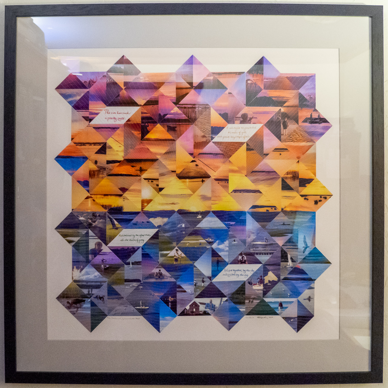
Framed.
Click on image for larger view.
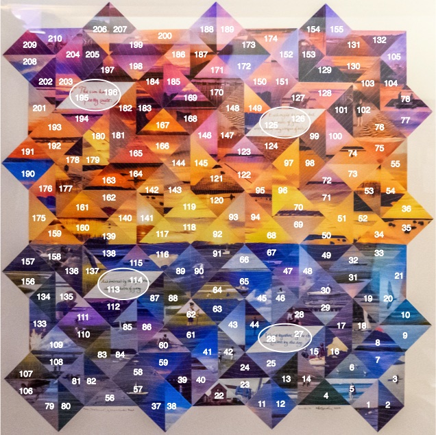
A total of 82 original photos were used to create 92 cropped images. Multiple quadrants of each cropped image were used to fill the 202 spaces, and the scan of the poem filled the remaining 8 spaces (circled in the image below).
| Click on cell # below for original and cropped image | |||||||
|---|---|---|---|---|---|---|---|
| 1 | 2 | 3 | 4 | 5 | 6 | 7 | 8 |
| 9 | 10 | 11 | 12 | 13 | 14 | 15 | 16 |
| 17 | 18 | 19 | 20 | 21 | 22 | 23 | 24 |
| 25 | 26 | 27 | 28 | 29 | 30 | 31 | 32 |
| 33 | 34 | 35 | 36 | 37 | 38 | 39 | 40 |
| 41 | 42 | 43 | 44 | 45 | 46 | 47 | 48 |
| 49 | 50 | 51 | 52 | 53 | 54 | 55 | 56 |
| 57 | 58 | 59 | 60 | 61 | 62 | 63 | 64 |
| 65 | 66 | 67 | 68 | 69 | 70 | 71 | 72 |
| 73 | 74 | 75 | 76 | 77 | 78 | 79 | 80 |
| 81 | 82 | 83 | 84 | 85 | 86 | 87 | 88 |
| 89 | 90 | 91 | 92 | 93 | 94 | 95 | 96 |
| 97 | 98 | 99 | 100 | 101 | 102 | 103 | 104 |
| 105 | 106 | 107 | 108 | 109 | 110 | 111 | 112 |
| 113 | 114 | 115 | 116 | 117 | 118 | 119 | 120 |
| 121 | 122 | 123 | 124 | 125 | 126 | 127 | 128 |
| 129 | 130 | 131 | 132 | 133 | 134 | 135 | 136 |
| 137 | 138 | 139 | 140 | 141 | 142 | 143 | 144 |
| 145 | 146 | 147 | 148 | 149 | 150 | 151 | 152 |
| 153 | 154 | 155 | 156 | 157 | 158 | 159 | 160 |
| 161 | 162 | 163 | 164 | 165 | 166 | 167 | 168 |
| 169 | 170 | 171 | 172 | 173 | 174 | 175 | 176 |
| 177 | 178 | 179 | 180 | 181 | 182 | 183 | 184 |
| 185 | 186 | 187 | 188 | 189 | 190 | 191 | 192 |
| 193 | 194 | 195 | 196 | 197 | 198 | 199 | 200 |
| 201 | 202 | 203 | 204 | 205 | 206 | 207 | 208 |
| 209 | 210 | ||||||